Let's Talk
If you have a role or opportunity that sounds like a good fit, I'd love to hear from you. — Chris
Connections Academy Schools are tuition-free K-12 virtual schools—offered in 29 states serving more than 100,000 students throughout the United States. A division of Pearson Education.
The objective of this project was to reduce the administrative burden of teachers attempting to search for and communicate with students. In return, teachers can spend more time on individualized instruction for students, which increases student and parent satisfaction.
I leveraged existing user research to inform design decisions. From there, I used low-fidelity sketches, high-fidelity mockups, functional prototypes to communicate the design with stakeholders.
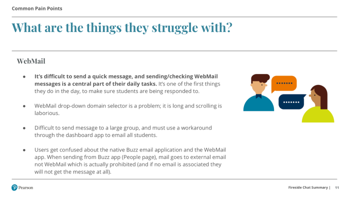
Teachers told us they want to spend less time on administrative tasks and focus on what they do best, teaching. A Connections Academy teacher can have a large cohort of students to contact and keep track of—over 200 in some cases. They were spending too much time managing student contact lists and searching for contact information.
As the UX Design Lead, I was responsible for partnering with stakeholders, project managers, and architecture to design a solution.
The two primary personas for this product are teachers and students. Online teachers want to focus on the academic needs of students and less on administrative tasks. For students, they want a flexible schedule to accommodate other interests.
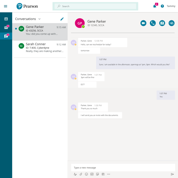
The design scope included a new messaging app between teachers and students, with the plan to add additional functionality in later phases.
The design and prototype needed to be ready for a team to pick up during the next PI Planning (Scaled Agile Framework) event. And would be developed for the next school year cycle.
User Research: I reviewed existing qualitative user research, user scenarios, and business requirements we conducted.
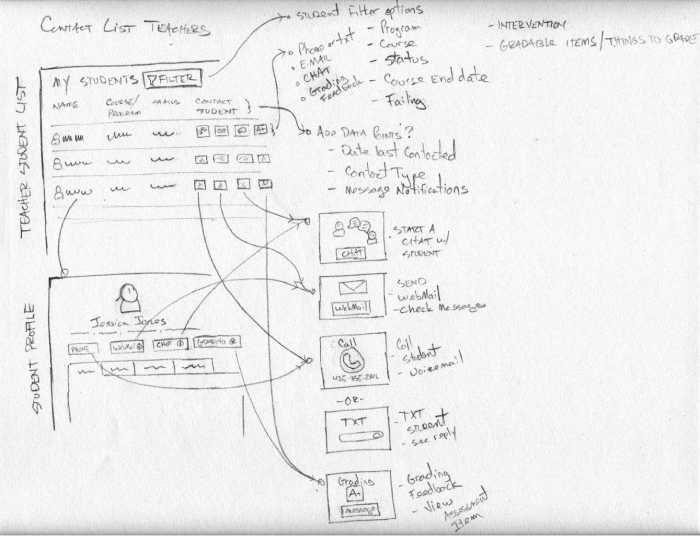
Sketch and User Flow: Start ideating by sketching out wireframes, user flows and annotating with questions. Sketching allows me to generate ideas quickly and show a rough concept to the product manager and UX design peers for feedback.
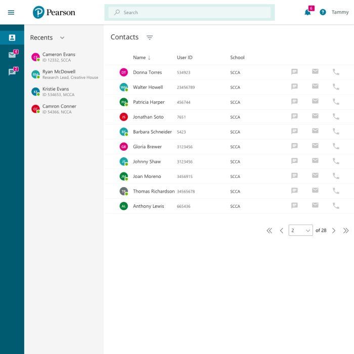
Hi-Fidelity Mockups: I produced a higher fidelity version from sketches to collect feedback from the product manager, engineering, and teachers, by applying visual design, branding elements, and click-through functionality within InVision App.
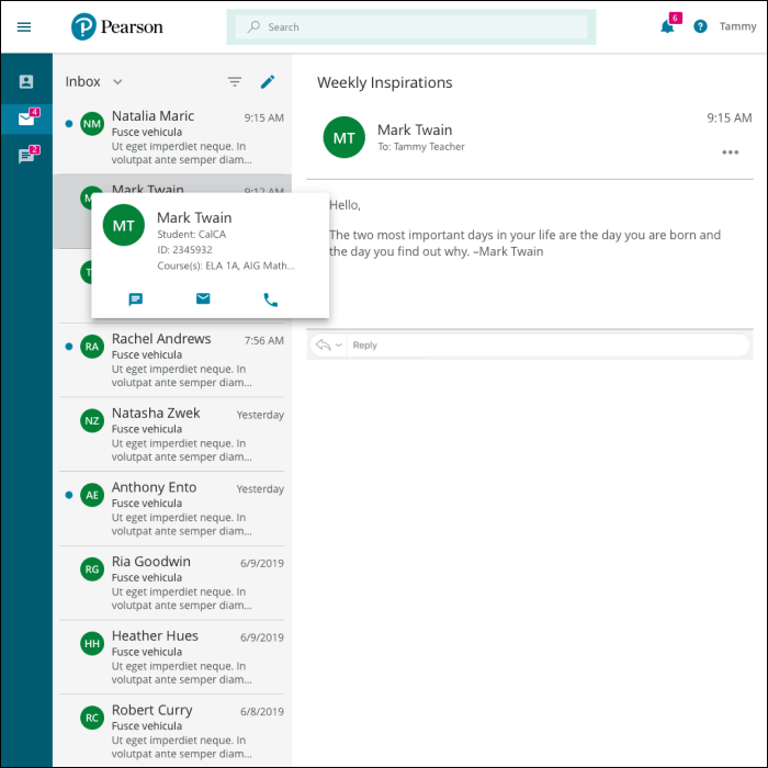

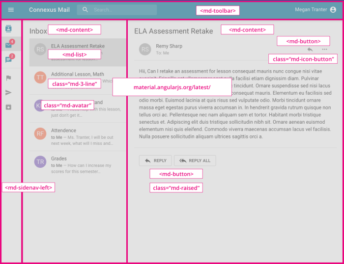
Functional Prototype: I coded an HTML prototype using the Angular Material Framework with a custom theme for our branding to improve the designer's development handoff. In addition, the prototype reduced the discrepancies between the front end and mockups.
The product organization piloted the application with three schools with limited functionality. The feedback we received from the schools was that the application was missing some core functionality for teachers to do their jobs effectively.
The product leadership team decided to roll back to a previous version of messaging application and re-assess the product strategy and business value.
If you have a role or opportunity that sounds like a good fit, I'd love to hear from you. — Chris